
Yes, there are many recognizable patterns that seem like they are appearing again and again, but there is a good reason for that. From an industry perspective they are called design techniques, but usually people refer to them as design trends, which is intuitive because new, exciting and innovative elements are the ones that are trending the most throughout the web.
In this post, we will dive into the finest that this field has to offer. The following elements have been recognized by modern web designers and will be getting more and more into most of the websites we see while browsing. They are created by talented people who have what it takes to push the boundaries and discover what hides beyond them. Enjoy the excitement that the future of web design brings…
Listed icons and features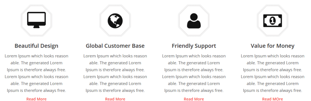
Mobile apps, creative agencies and startups are known for utilizing unique graphics and blocks of text to accent the elements in their websites. You will often find these features listed on the homepage with a couple of sentences paired with small and attractive icons.
This is not specified as a separate example among the recent trends and has no official name, so the term feature lists will do for now. They are very helpful and key to understanding what the text is about because it helps describe the text-based lists with icons that show what you mean by those few sentences.
Such features and icons can include a list of services provided by a company or something more complex like the building blocks of a piece of software. This is becoming an even more popular trend being used by hundreds of websites for all types of purposes.
Check out the place where you can find useful and attractive icons:
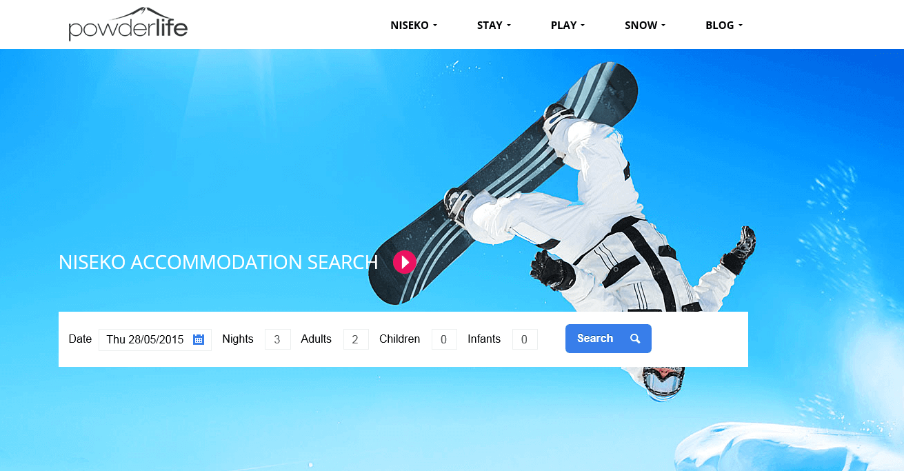
Sliders and galleries
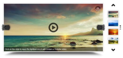
An enticing dynamic gallery and media slideshows for screens of all sizes are a must for every designer to include in their website. You have definitely seen websites that show you intoxicating images followed up with even more engaging landscapes or other graphic features. These slides can be used to convey a message or information regarding a product and leave the homepage feeling clean and smooth.
This is the single most important foundation of any unique website. Since digital media and images have become one of the most popular elements that users expect, it is a must to include these features in the most easy-to-use way possible.
There are countless different ways for you to manipulate a slideshow or a dynamic gallery to perfectly present whatever you want to get out there. You can utilize it for a header, or for a full-screen slider that helps you keep the layout of your site simple.
Browse through these unique gallery and slider options click here!
Responsive storytelling
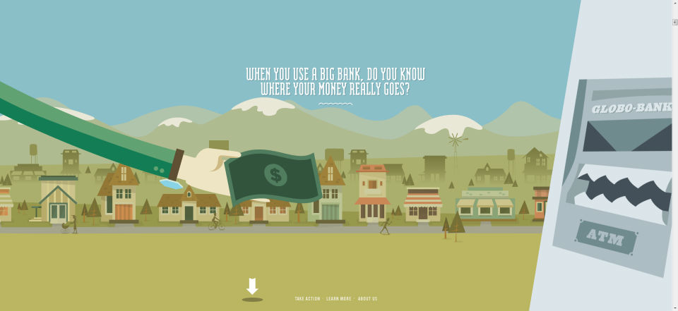
Some SEO specialists may argue, but the facts are facts – telling a story will engage a person and get their attention. And there is nothing more useful for SEO than this. This type of design actually has its own name and it is called Parallax design. It combines beautiful presentation with well thought out elements that give the readers what they need in an engaging way that helps them understand better what you have to offer.
Almost every website, whatever its purpose, has some kind of a story to tell. However, its contents are not always laid out in such an enticing way. Parallax elements help the storytelling become more natural and because of their simple character they often rely on a single page. Everything from graphics and animations to text and page sections are easily accessible without the need for reloading the page, which is a substantial plus!
Grids and blocks
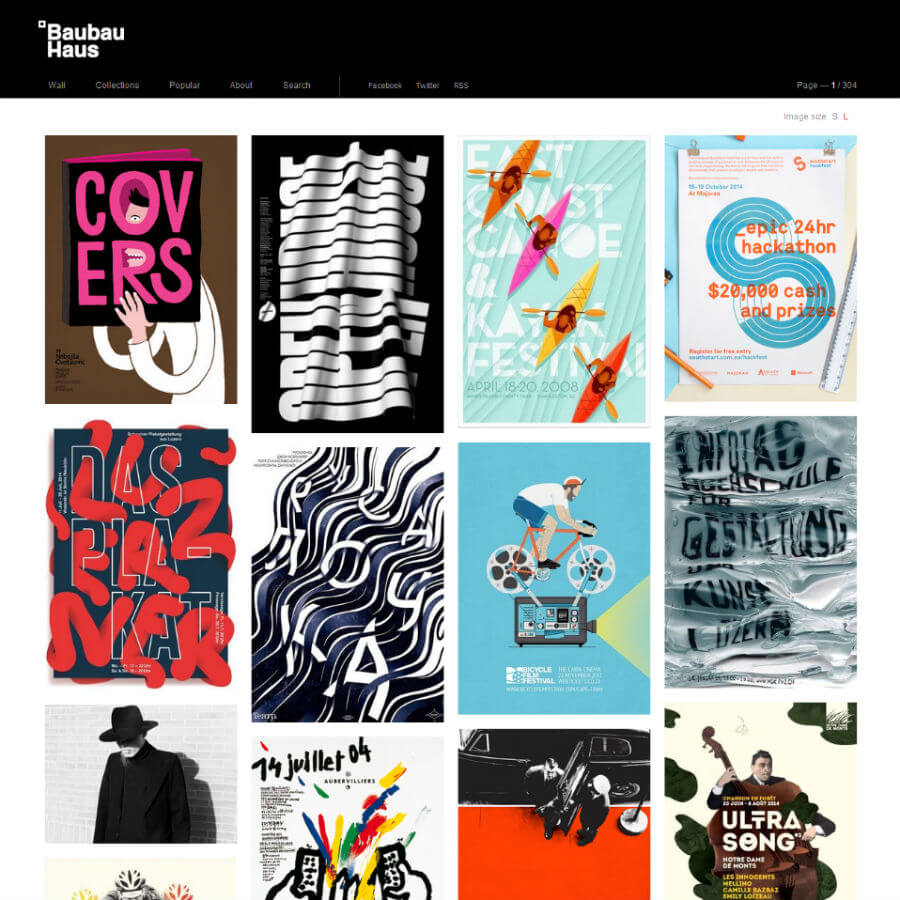
This is an amazing technique for a business-oriented website where you want to present your products and services in a well-organized layout where the reader can quickly find out what they need. Grid layouts have been used for quite a while and it is a very popular choice, especially on websites that require space for bigger content lists. By using them you can avoid putting all the content in the page making it look like a long, endless and boring novel.
One of the greatest and most positive aspects about grid-based design is the unmatched flexibility and the endless possibilities it unlocks. It can be designed in a very responsive way that makes it very simple for quickly acquiring information, and it fits perfectly for mobile devices and tablets!
By simply resizing the blocks and filling them with all kinds of features such as images or a few sentences you can make a very unique and personalized design. CSS grid libraries can be easily found all over the web so that you can get started on making your website much more easy to understand and use!
Fixed navigation bar
Do not get confused with fixed headers. Yep, they have been around for years, but the advancements have not passed them by without acknowledging what can be improved over there as well. The majority of designers are now using fixed navbars that always stay on top of the page regardless of the scrolling you are doing.
A common method is blending the navigation bar with the image in the header which is a very elegant and stylish feature. Dark backgrounds are easy to use when planning to implement this method in your page. Blending the header with the links in the navbar seamlessly is key here, so focus on the details and be mindful of the space you are taking when the navigation bar remains while scrolling down.
Learn how to do this for your website as well click here
User interface solutions

UID, or User Interface Design, goes hand in hand with UX, or User Experience-based design. They complete each other in producing a stunning result that users like to see and work with. Mostly seen and optimized for iOS based devices and platforms, the UI features are based on very simple and functional elements. Sometimes utilizing three-dimensional effects that help the various elements to pop up and catch the eye, this type of design is also evolving.
The most recent trends we see are the exact opposite of 3D – flat design. It helps for creating more efficient designs that are focused more on functionality and less on the eye-candy. The website will load faster and will be easily resizable, which has substantial effect on the performance for different devices.
Custom animated elements
After CSS3 was introduced to the world of design, web developers have been tirelessly toiling over creating animations with it. Since browsers are now more advanced and capable of supporting CSS3 elements it is only natural that the developers will be even more busy.
One of the most popular trends we see with CSS animation is the modern effect of the scrolling element. This may include fading in and out elements while you are browsing through the page. Of course, this also requires some knowledge of JavaScript to handle the classes, but the most incredible thing is that all of the animations can be fully controlled using CSS3.
However, if you are a new designer, this may be a bit difficult to grasp as it definitely is a tricky concept. The great thing is that it actually shows how CSS3 has obviously advanced and evolved in just a few years. Front end development is definitely speeding forward with all force, and saying that the future is more than exciting is simply not enough. We definitely look forward to seeing what developers have in store for us!
Animation is far easier to access and include in your site. Check out how click here!