Have you already noticed the “more results” link – the new Google mobile search interface? The 411 Locals team definitely did, but we cannot say that we haven’t been warned. Google told us that they will constantly experiment with new formats in order to deliver a better and better experience. In this article, we will give you more information about the “more results” new interface and the new search buttons to refine your search directly in the search results snippets.
The new “more results” feature on Google mobile search
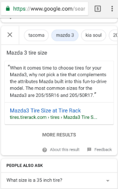
This new search interface shows fewer search results on mobile search results page than what we are used to. In addition, there is an option to click a button labeled “more results.” Instead of the long list of search results we will now see two to three, sometimes up to five, but never more organic results.
This is definitely a “less is more” strategy, and we can see it totally makes sense. People are just not paying attention when there are so many results, and we just click on the first results automatically. This is great news for SEOs as competition grows, and we now expect more successful PPC campaigns with pages not necessarily ranked on the “first page”.

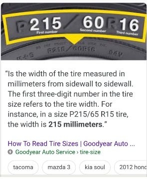
In the screenshot, we can also see the improvements at the top of the picture. Check out the other screen shot of them directly in what is called a featured snippet.

More and more searches are begging you to notice the changes as Google has been testing both of these for at least a few weeks. And did you? The 411 Locals team is positive that Google will soon announce this officially and while we cannot know for sure this news will reach everyone, we strongly support the “less is better” idea.


