
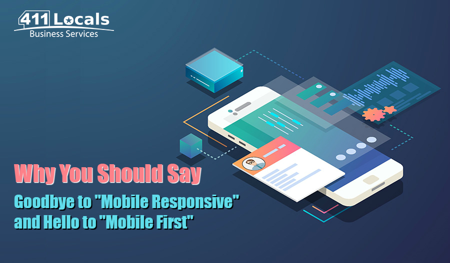
It is no secret that mobile is all the rage nowadays, both literally and figuratively. Why? Because it makes users full of rage when your site A) does not support a mobile version, and B) has a mobile version that was clearly not designed for small screens. This is why, in today’s 411 Locals blog, we will go over the difference of “mobile responsive” and “mobile first” in hopes of helping you create a better user experience for your site visitors.
The Differences Explained
Although they are more or less made up of the same components, their approach and strategy are very different.
Mobile Responsive (MR)
This is a technical web design approach where designers use CSS to adjust the site to the device it is viewed on. In other words, mobile responsive means you already had a website built for desktop users, and it was then converted to work on mobile screens as well.
Mobile First (MF)
Unlike MR which is an approach, MF is actually a web design strategy. And while it can be built upon a mobile responsive framework, it is customized, so it places mobile users’ unique needs at the forefront. Here, instead of building a desktop website which is then forced to fit into a mobile box, you are actually creating a site that considers mobile users first. If you are wondering why that is so important, remember that 52.64% of all internet traffic actually comes from mobile devices.
Quick Tips on How to Rock Your “Mobile First” Strategy
- When it comes to content for mobile users, less is more. Of course, longer posts generate more leads but not when it comes to mobile readers staring at tiny little screens.
- Keep it simple. Of course, you want to display as much information as possible on your site, be it in content or images, but refrain from overcrowding your pages. It will keep people constantly distracted while you guide them to the product or service you are offering.
- Do your homework well. Bring your CTAs to the 21st century, and do not annoy your readers by making them click on a link from your mobile version that leads to a non-mobile responsive page. Be thorough in creating a seemingly effortless UX for your mobile readers.
Hopefully, you are convinced now that mobile first is the right approach when creating your platform today. Of course, our SEO company can take care of a lot more than your website. When choosing 411 Locals, you are opting for a company that is recognized as a top Digital Marketing Agency by DesignRush, but that is a story for another time.
Stay tuned for our next topic!